In marketing, words pack a punch, and images can influence customers, but these alone may not be enough to motivate purchase behaviour. Submerge your customers into a fully multisensory solution with colour psychology — let’s dip into how colour can benefit multisensorial marketing and drive purchase behaviour.
The psychology of colour
In marketing, colour is an emotional cue. The impact of colour can inspire consumers, enhance your message and — most importantly — encourage purchase behaviour. As one of the psychological tools that marketers use to build brand awareness, understanding how colour works can enable you to elicit different emotions needed to trigger buying decisions.
But what has this got to do with marketing my brand?
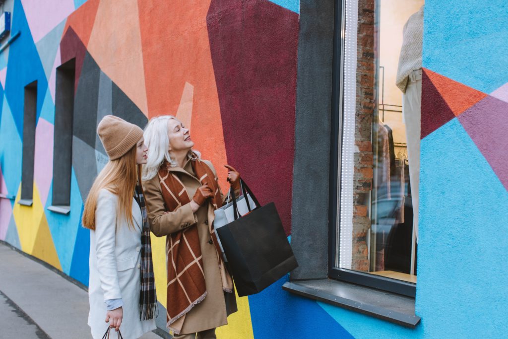
Shoppers rely heavily on visual appearance when considering new products, and colour may be a big part of that decision. Impulsive buying has a lot to do with how consumers feel, and little to do with what they need. If your potential customers enjoy the look and feel of your brand or brand’s space, and the colours are immersive enough to be persuasive, there’s a greater chance that they will buy into what your brand is selling.
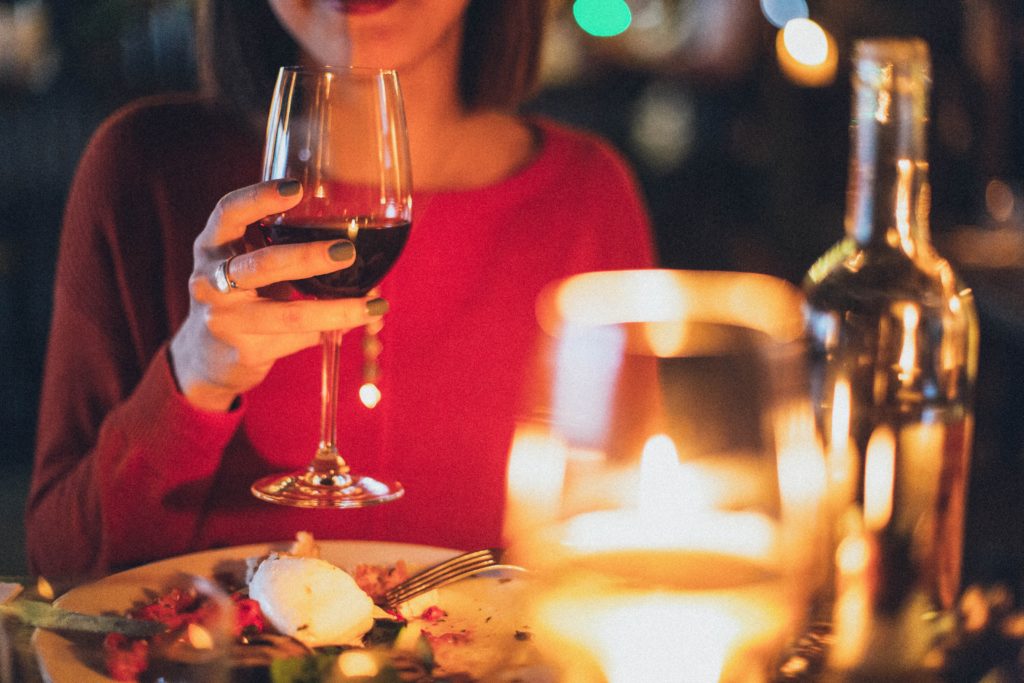
Think about walking into a brightly lit café, with vivid blues covering the wall and a lot of white space. You’re very unlikely going to be sipping wine until the late hours of the night in this environment. Whereas, light shades of earthy colours painted onto the walls combined with a little warm lighting helps customers relax and want to stay longer — which is why fine dining dinner restaurants utilise this to their advantage.
Understanding the psychology of colour and how it affects consumer behaviour can help you communicate a feeling to your audience through colour. You can help create feelings that in turn have a big impact on purchasing decisions.
How to think of colour as a part of multisensory marketing
The colours on your website designs, social media profiles and logo directly impact the way your customers perceive your brand. This is just as true for the marketing materials you use, such as your digital signage or the video content your brand puts out.
S.O.H Group’s visual works enwrap customers with radiant sensory delight. These are a bigger part of a multimode of sensory tools but play an important role in your sight and visual sense as it stands alone. Let’s discover how colours can impact feelings and moods and how you can use them in your marketing strategy.
Consider the colours to encourage purchase behaviour
Although there is no perfect formula to identify the best colour scheme, it’s essential to evaluate your audience and consider how they think about your brand’s colours. Let’s deep dive into what are the common perceptions of some of marketing’s favourite colours.
Blue
Often employed by companies that want to achieve safety and protection, such as banks and security companies. Blue lends itself to a sense of relaxation, calmness and clear-headedness but can discourage people from feeling hungry (so, not a good choice for a restaurant’s walls or menu design).
Yellow
Associated with warmth, happiness, playfulness and … caution tape. Employed to give warning, grab attention, as well as make messaging more digestible and seem more informative. Depending on your audience, yellow can invoke joy and excitement or generate some anxiety. Yellow on brochures or ebooks can create a sense of playfulness or urgency to buy for your brand.
Green
Popular with outdoor and garden supply stores, as it is the ultimate colour of nature. Green also relates to sustainability, ecological friendliness, growth, security and creativity. Green means go, and red means stop. This is the reason why many companies use green in the call-to-action buttons for social media ads.
Orange
A happy, fun and energetic colour that can prompt action and boost confidence — notice how many sports teams and sporting event marketers use this colour. Orange can also convey a sense of urgency, which may be great to use in “shop now” promotions for marketing materials.

Black
Black is a powerful and versatile pigment and can accentuate other colours. Black can exude elegance and exclusivity. It is one of the most common colours in the realm of high-priced goods, including designer fashion, makeup, jewellery, and luxury vehicles. Some banks have even developed special “black cards” that have incredibly high spending limits but are only available to an exclusive set of customers. Think about how your brand can create an exclusive group of customers, and how to show off the exclusivity through luxe marketing mailers, elegant store cards or traditional media advertising to invite more members to join.
White
White space and white backgrounds are the easiest way to ensure your branding has good contrast. White provides the feeling of cleanliness, wellness and lightness, making it an excellent colour for industries such as nutrition and healthcare. Too much white, however, can become uninviting and bland.
Red
The wildcard colour. Red is an attention seeker — there’s a definitive dominating air about the colour red, which is why competitive sports may use the colour. Red can be spun to your advantage as it triggers psychological responses like increased heart rate, sweating and hunger. Food industries should think about using red to stimulate food cravings and create a full-bodied sensory experience with the help of this colour.
Purple
Known as a symbol of royalty and luxury, deep purples are associated with power and mystique. Other shades may cause individuals to think about spirituality, imagination, creativity and innovation. Science museums, children’s play areas and other spaces that encourage creativity use purple to engage with their visitors.
Ways to use colour in driving purchase behaviour
Now think about how these colours could be used to help your brand create a multisensory experience for customers, where colour forms an integral part of the new age of marketing. For example, as a loungewear retail store, perhaps using soft pinks and greys would interest your customers as they enter your stores. To add to the experience, explore adding mood music and a signature floral scent that helps customers not only see who your brand is but feel it as well. This is a sure-fire way to increase your target audience’s purchase behaviour.
Using warm colours like red, orange and yellow is appealing to impulse buyers who respond to perceived urgency. If you’re holding a sale in-store, using these colours for sale signage and sale stickers, as well as online ads, can motivate your shoppers to spend more money just by creating a sense of “buy before it’s too late”.

Paint the path for your goal purchase behaviour
Create an experience for your customers and the more likely they are to buy into your brand. Treat colour psychology as an important tool of multisensory marketing.
Got some marketing ideas you want to get started on? Contact our team of marketing experts for a multisensory solution to enhance and grow your brand.